For teens
Shading and Blending: 7 Tips to Make Your Coloring Pop
Simple techniques for teens and adults — light sources, layering, gradients and highlights — that make any page look more finished.
Filling every space with one flat color is relaxing, but a few simple techniques can make a page look almost three-dimensional. These work best with colored pencils, and most of them work with markers too.
1. Choose a light source
Decide where the light is coming from — top left is a classic. Everything facing that way stays lighter; everything facing away gets darker. This one decision makes shading consistent across the page.
2. Layer lightly
Press softly and build color in several layers instead of one heavy pass. Heavy pressure flattens the paper's texture, so later layers won't stick.
3. Use three tones of one color
Pick a light, medium and dark version of the same color — for example pale green, green and dark green.
- Cover the whole shape in the light tone.
- Add the medium tone on the side away from the light.
- Add the dark tone only in the deepest shadows and edges.
4. Blend where tones meet
Go back over the join with the lighter tone using small circles. A white or colorless blender pencil smooths it out even more.
5. Leave highlights
The easiest highlight is no color at all. Leave a small white spot on shiny things — eyes, crystals, a pumpkin's curve — and they'll instantly look glossy.
6. Use a complementary color for shadows
Instead of black or grey, try a touch of the opposite color on the color wheel: a little purple in the shadows of yellow, or a little red in the shadows of green. Shadows look richer and less muddy.
7. Fill the background last
A soft background — a gentle gradient, or a single light color — makes the main subject stand out. Keep it lighter than the subject.
Practice pages
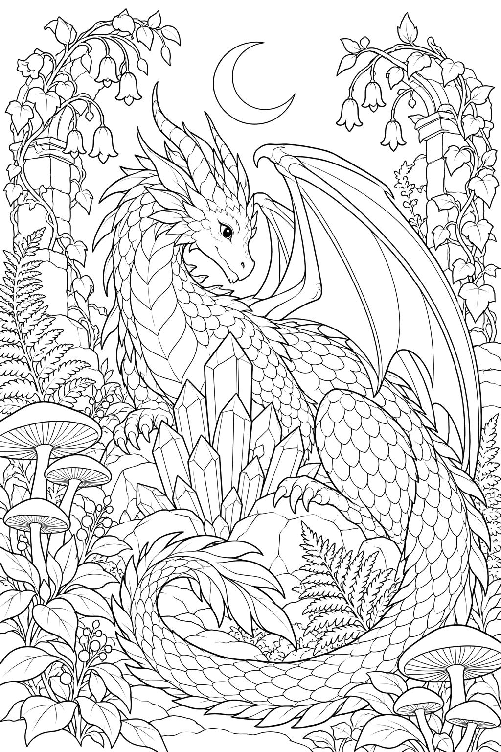
Detailed pages give you the most room to practice: try dragons in fantasy creatures, mandalas, or anything in For teens and For adults.